irmas gallery and residence
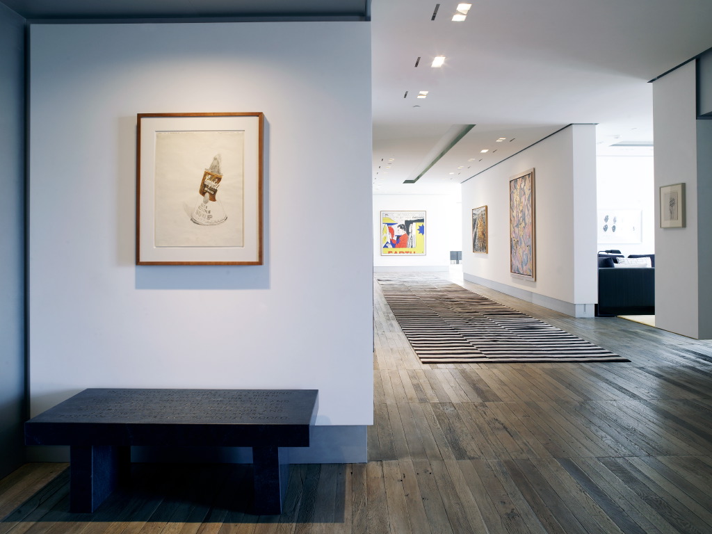
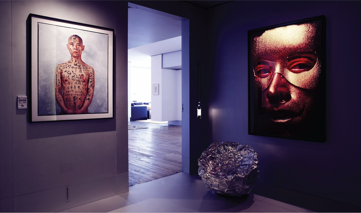
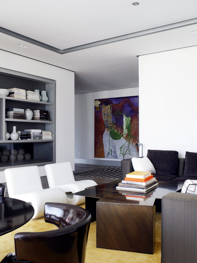
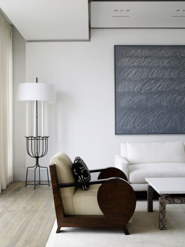
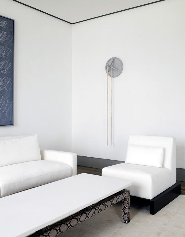
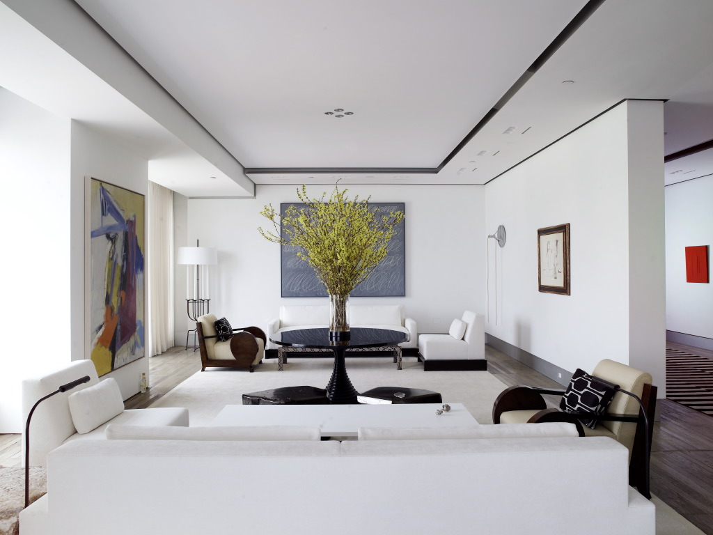
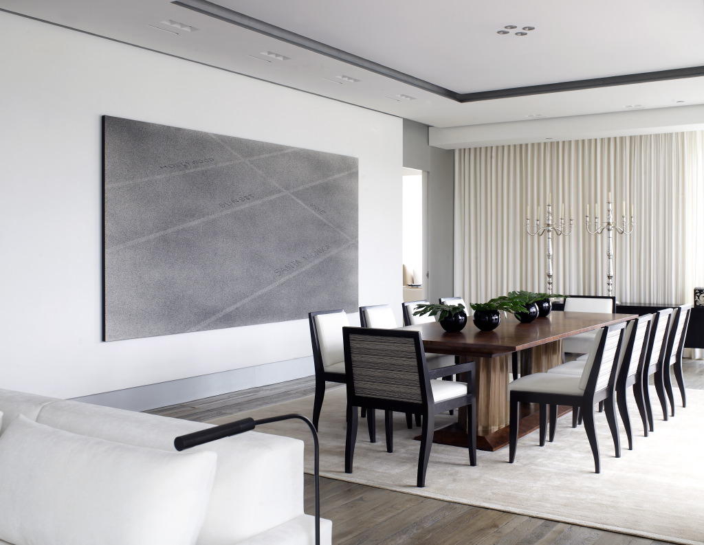
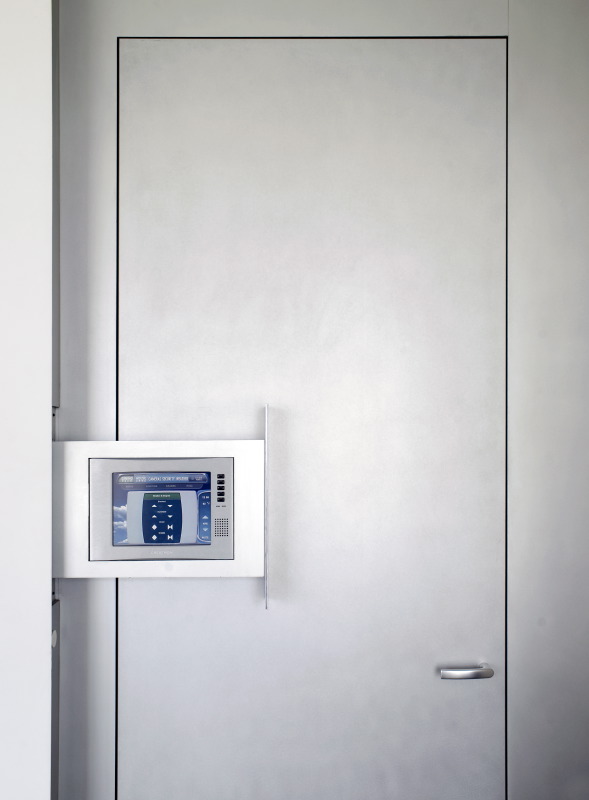
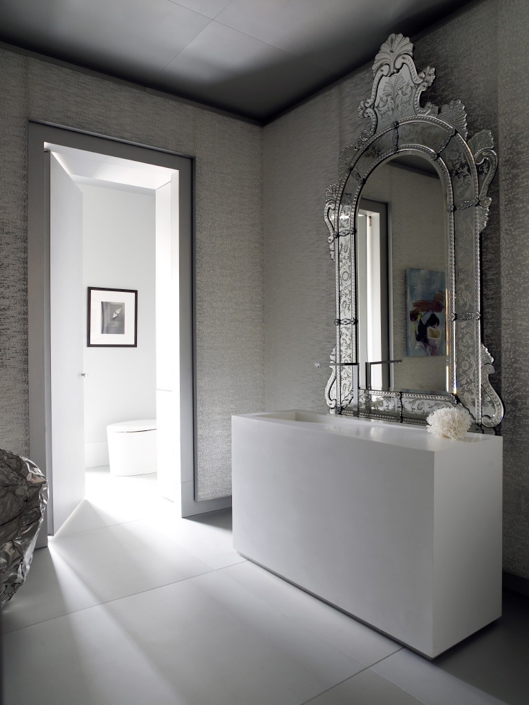
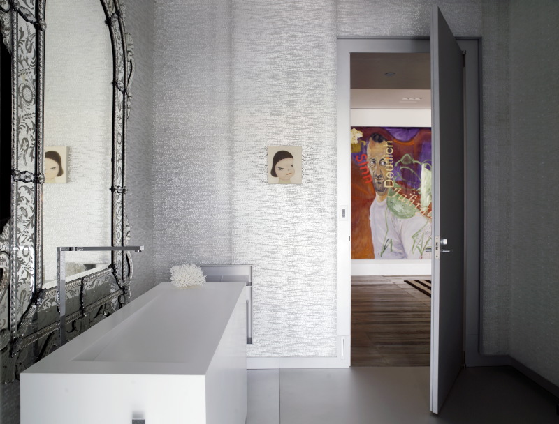
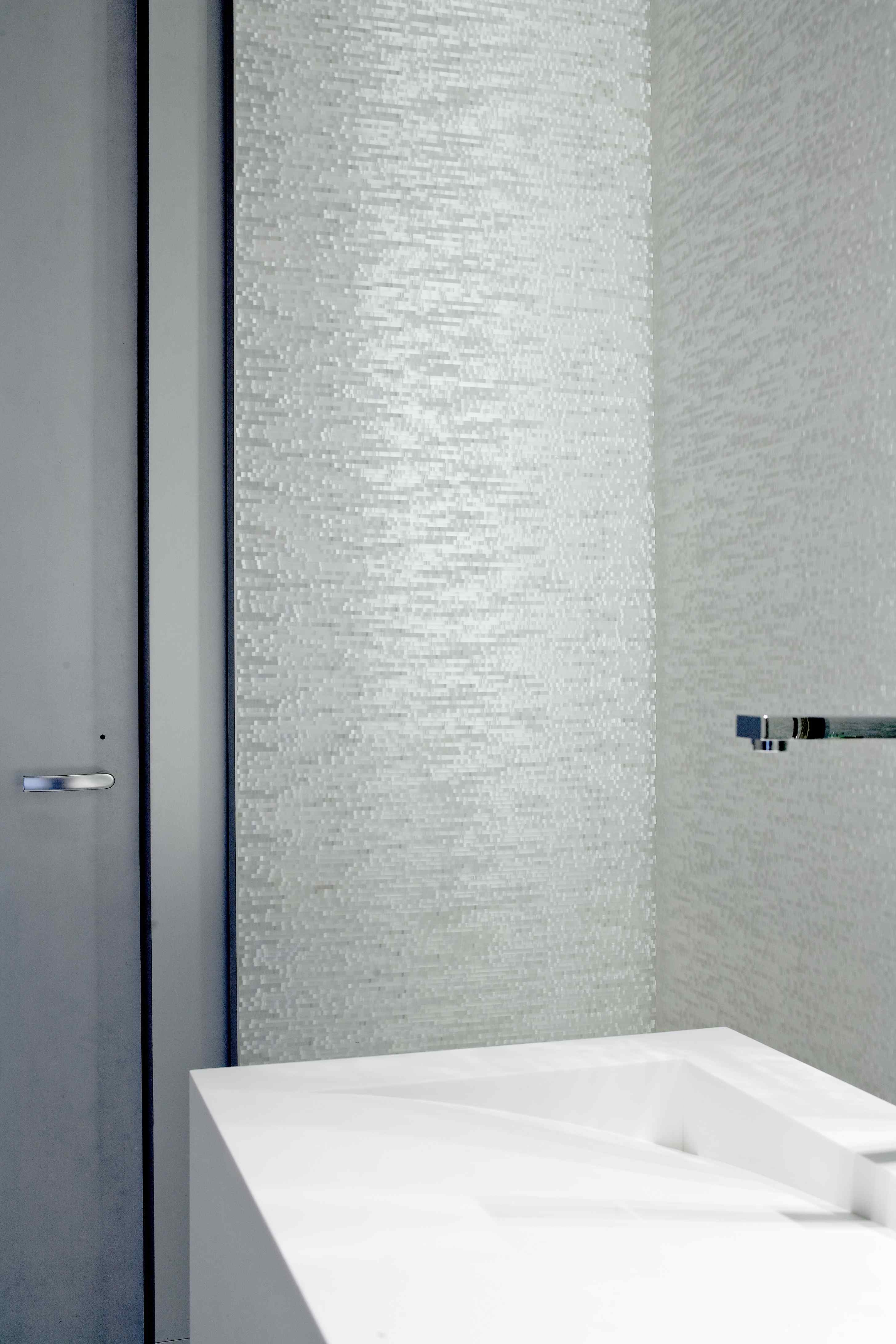
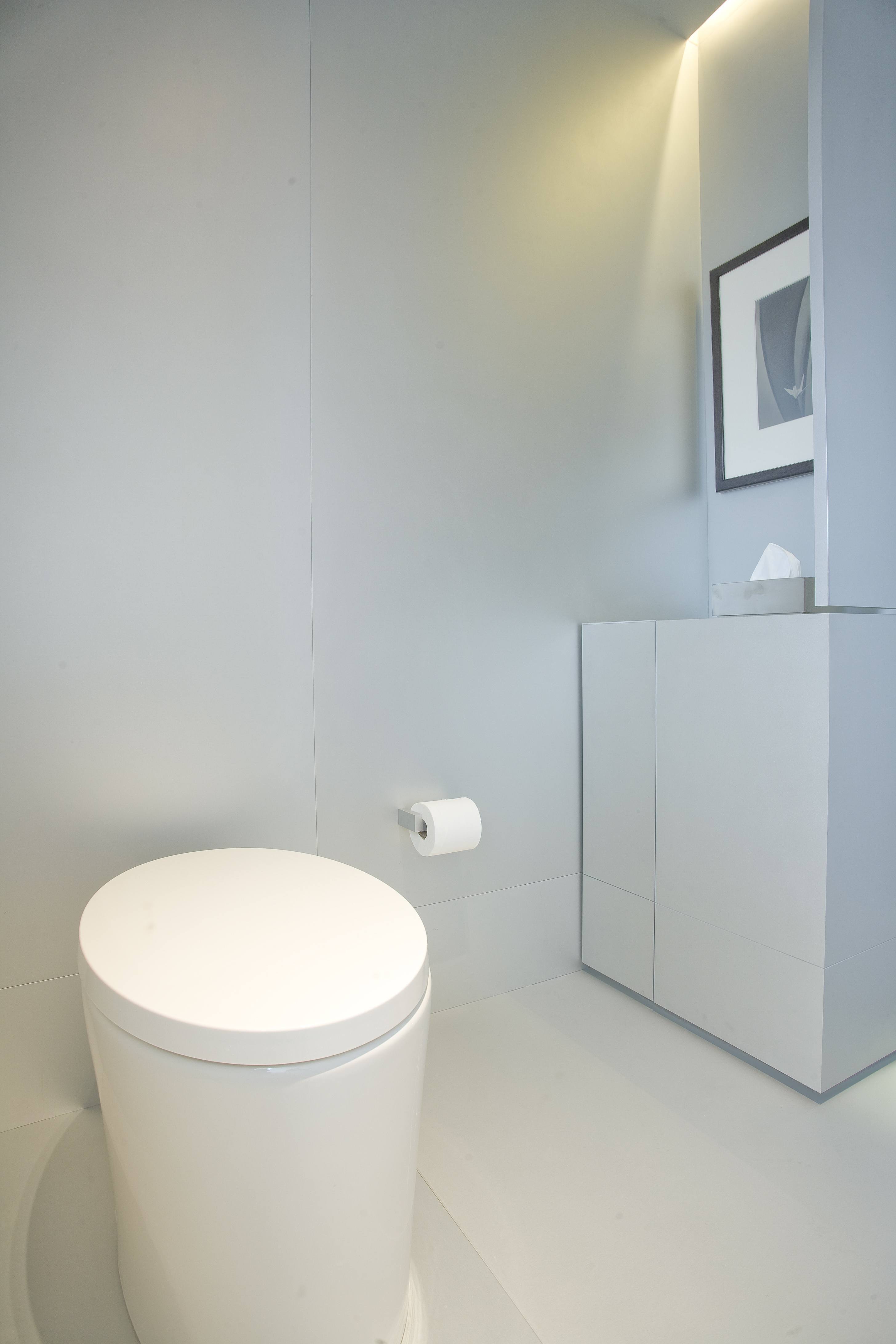
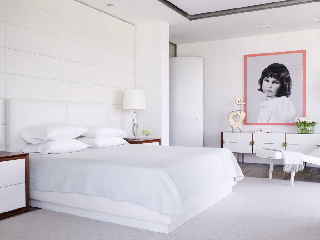
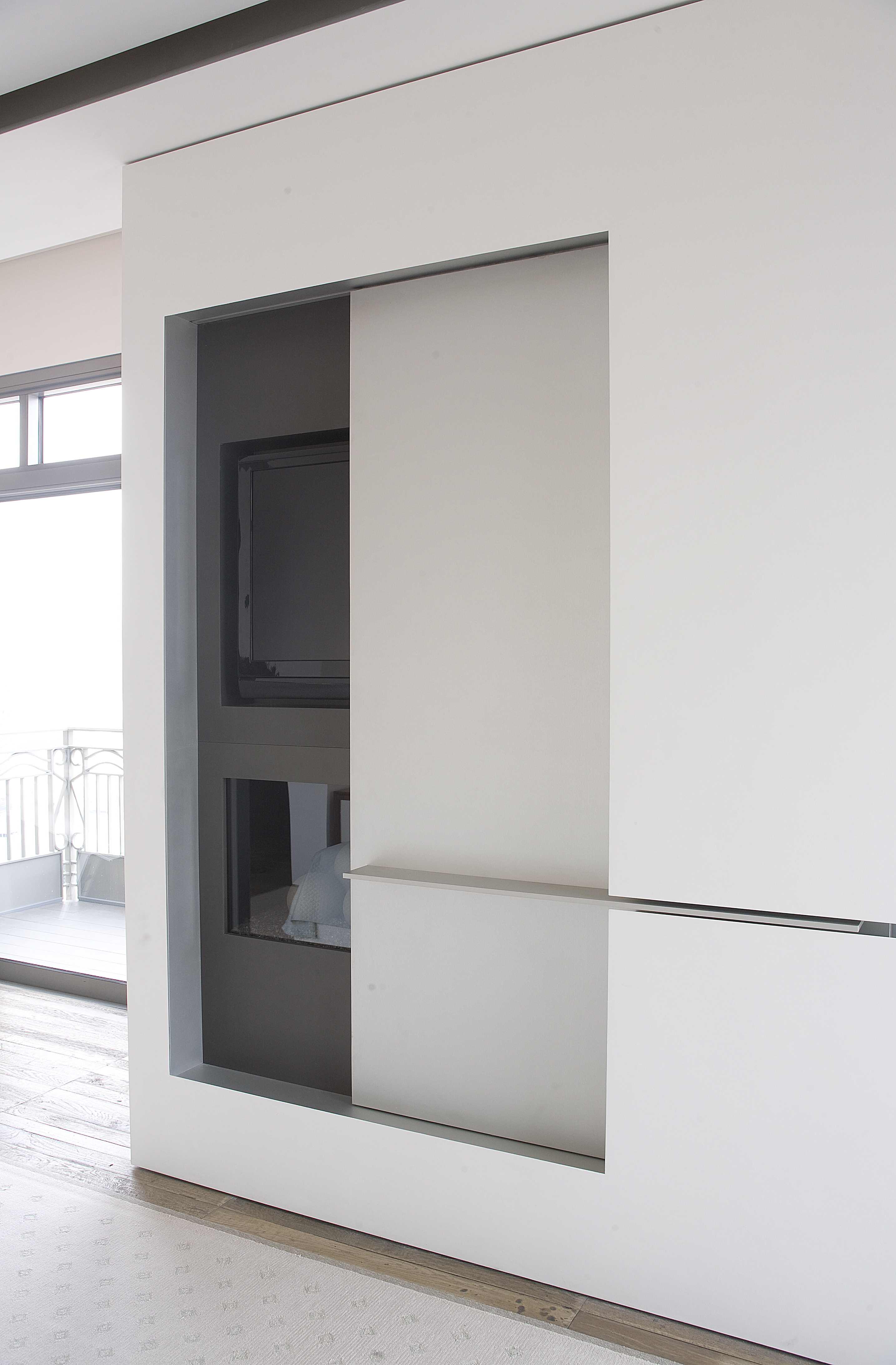
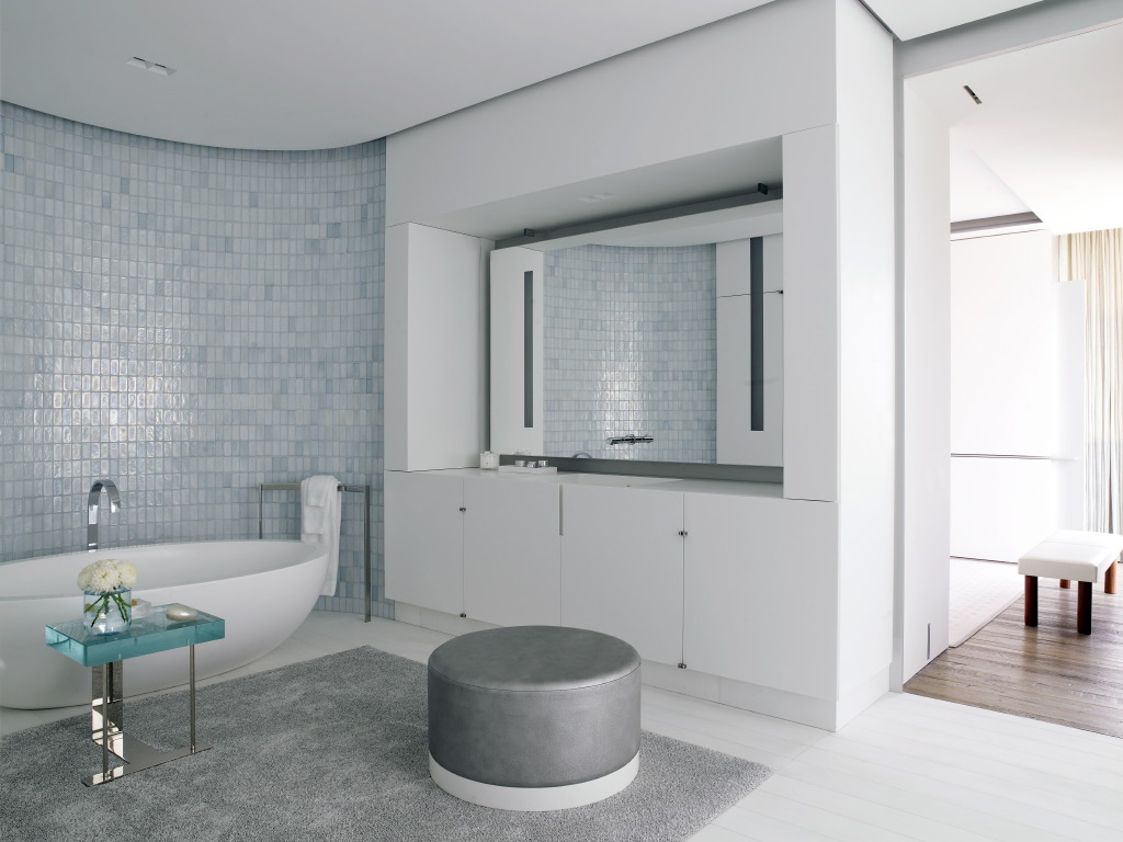
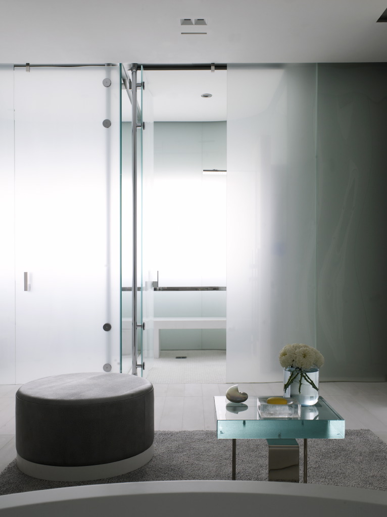
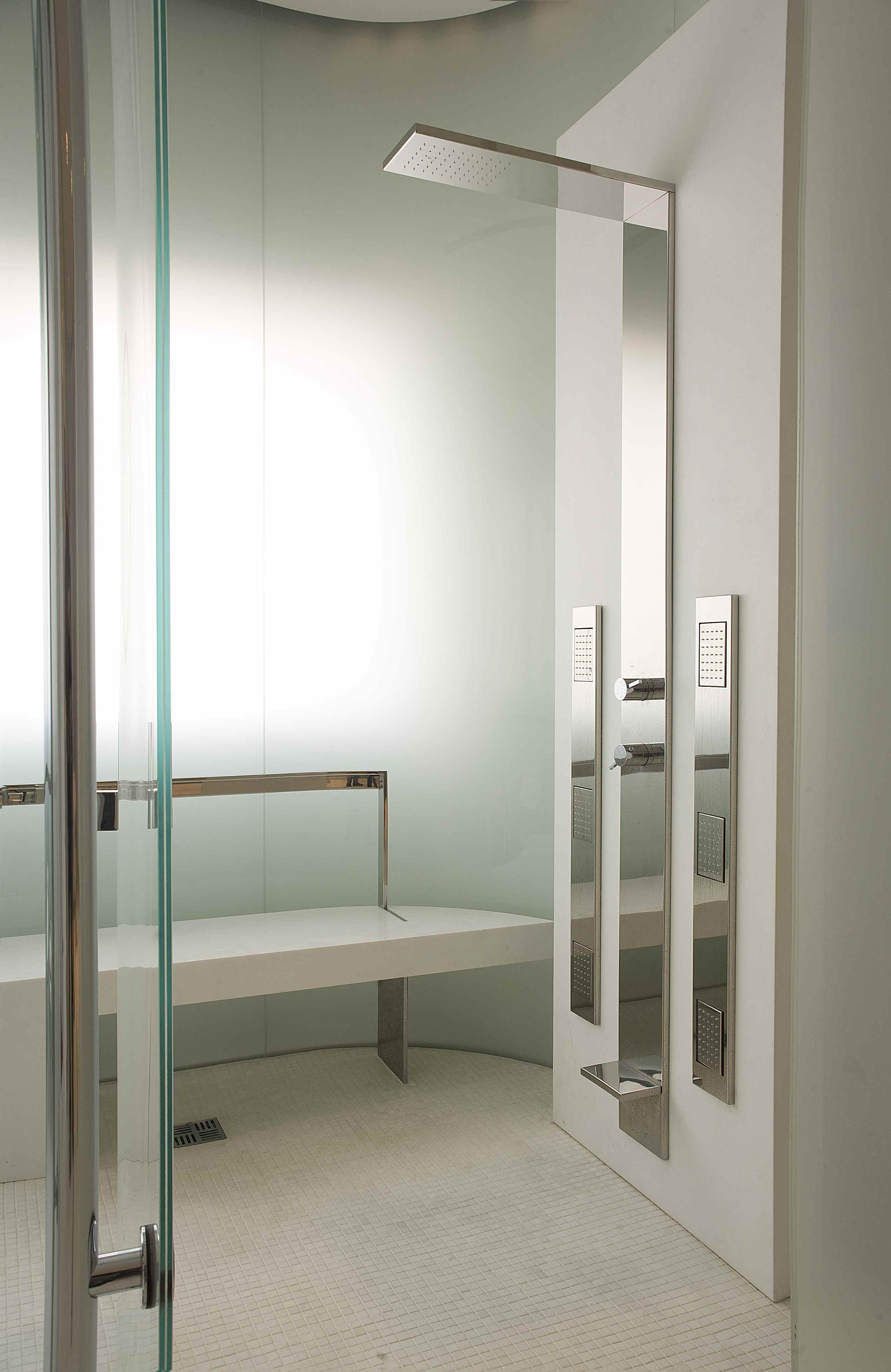
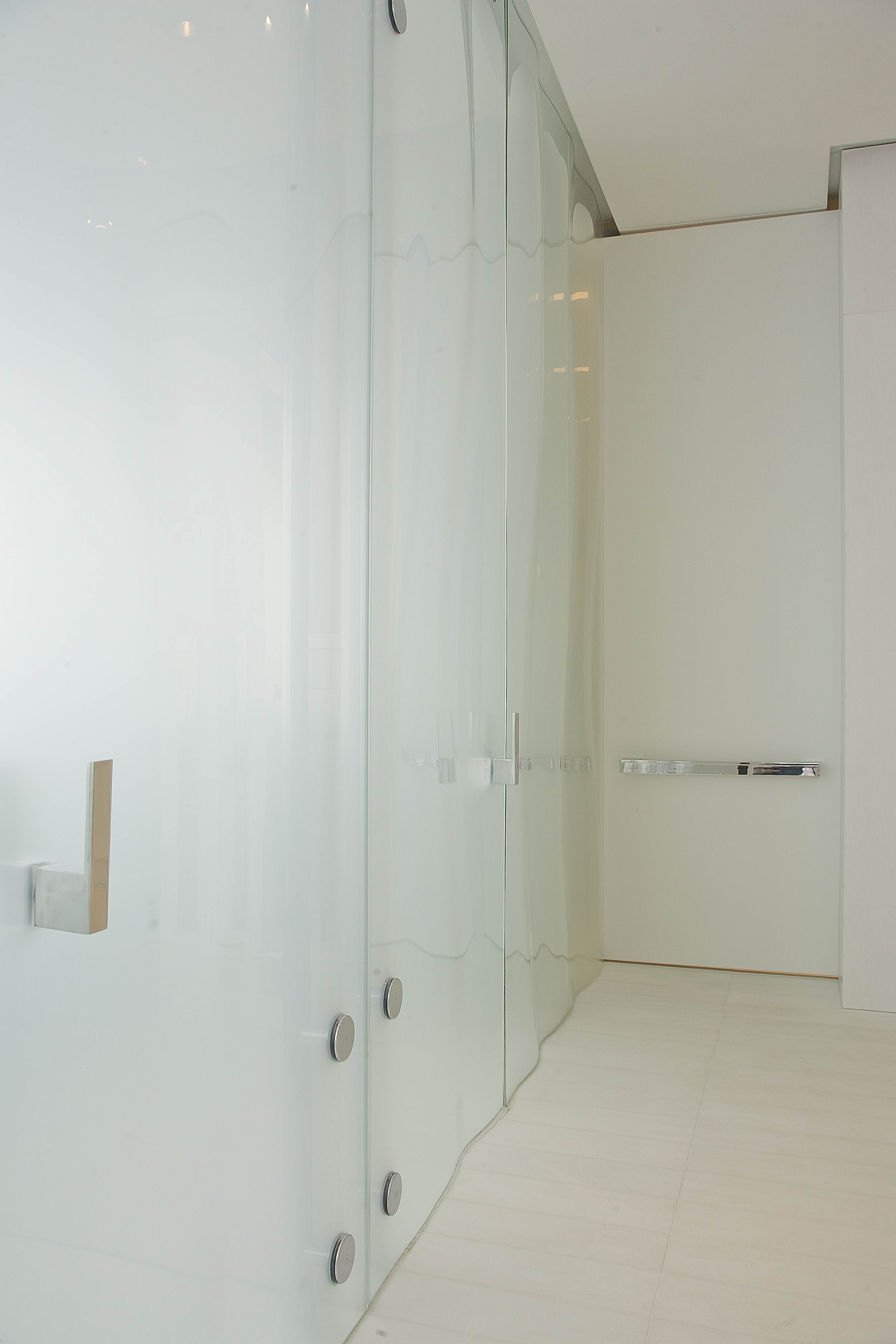
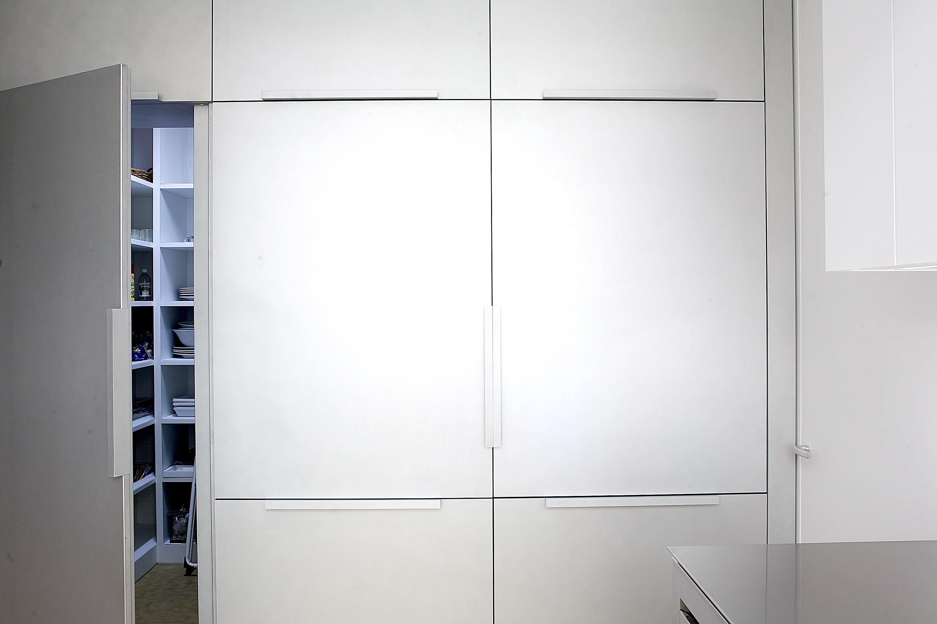
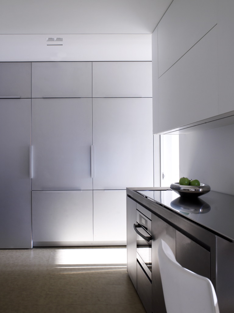
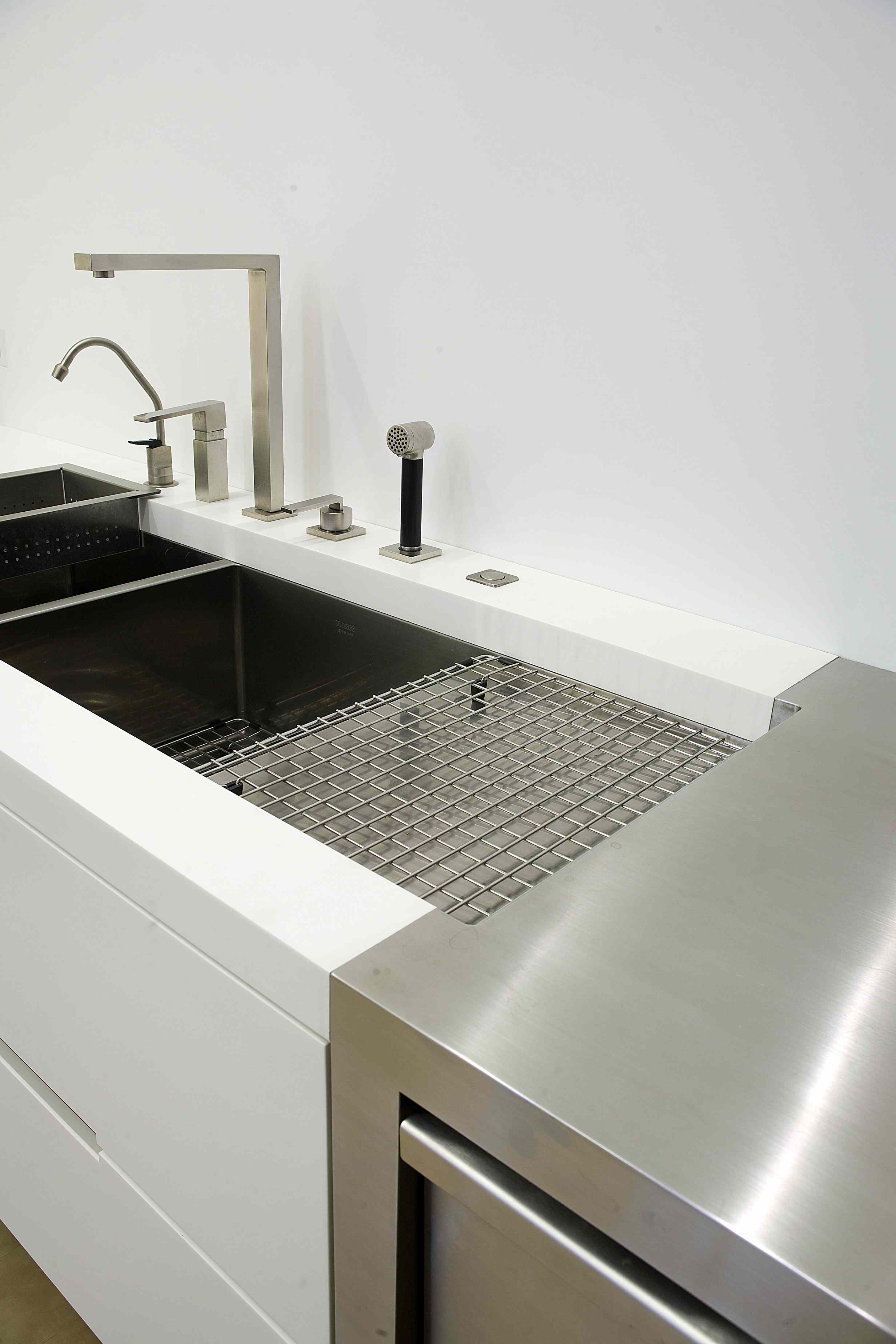
A residence and gallery consisting of 5800 square feet with extensive views for a contemporary art collector. Typically our work deals with sculptural forms and their relationship to each other, this project attempts to construct a design language of assemblage. Layering the architecture into the connections between planes of paper thin limestone plaster sheets. All the traditional markings of “building” are removed; switching, outlets, lights, mechanical systems are hidden in the crevices between surfaces. Concealed control touch screens slide out from behind planes. The subtle layering of surfaces create depth vertically and horizontally without sacrificing display walls. All non-exhibit walls are soft matt finish aluminum plate, white corian, or wood. Ceiling surfaces are thin limestone plaster, mylar sheets (with acoustic control), and aluminum plate. Sculpted glass walls create fluid organic surfaces in the master bathroom. All fixtures and hardware are custom designed and fabricated for the project, including all light fixtures, mechanical distribution, controls, hardware, plumbing fixtures, and fireplaces.
The following is an exerpt from an interview with the Los Angeles Times:
“The design language for most of my projects revolve around the interplay between sculptural form, natural light, and the materiality of surface. The penthouse apartment was a little different for two reasons. First, because the art collection is the main focus of the apartment, the space needed to subvert any desire for sculptural form to not detract from the presentation of the art. The second difference is because natural light is controlled by the shell of the building, and is not wanted for the art, the traditional juxtaposition of form and light for me is not valid for this project. This left me with the materiality of surface as a genesis.
With surface materiality as a starting point, I began with what would best showcase the collection, a white box. The challenge became how to create detail, richness, scale, and develop a materiality to the surfaces while playing second to the collection. Therefore, the white box is “carved” away to create conditions of depth, creating horizontal and vertical spaces which further accentuate the “materiality” of the white boxes surfaces. “Carving” created secondary spaces deep into the aluminum, and allowed the white box to remain as a minimally articulated space. The details would be subtle and exist within the carvings. The bathrooms were areas that, because there was no artwork, the spaces could play with sculptural form and light (natural or artificial). One, carved from white, one carved from aluminum, one carved from dark stone. The fourth, the master bathroom is for me where all the compositional elements come together, and sculptural form trumps materiality of surface. It’s sort of where we let our hair down.
Great architecture and interiors regardless of style have a shared component, artisanship. Modern design doesn’t always allow for true craftsmanship to be featured as an equal part of the design, it might be there, but subverted. I believe in creating details and resolutions between materials that require true artistry in construction. That sort of effort and care in crafting a space adds a level of richness that is so often missing in what you once called “plywood modern” architecture. The energy and thoughtfulness brought to a project when everyone feels challenged to produce their best work stays in the space long after they are gone. It is what is missing so often in projects today.”
